
Architecting History:
Engineering Targeted Digital Pathways for Teachers and Students Nationwide
Designed the complex "Learn" section architecture and rigorous functional specs, steering a large design initiative with a smithsonian affiliated museum.
I led a complex UX redesign for the Admiral Nimitz Foundation, replacing a legacy interface with a strict layout system to unlock critical WWII history and lesson plans for remote educators.
Business problem, not just UX problem: The museum needed to expand its educational footprint beyond physical visitors. The digital "Learn" section was poorly architected, failing to deliver the museum's vast historical resources effectively to its core remote audiences.
Stakeholder landscape: Balancing the expectations of the Foundation's board with the practical, everyday needs of teachers, students, and historical researchers.
What hadn't been done before: Transforming a legacy museum website into a structured, digital-first educational hub with targeted pathways for distinct user groups (teachers vs. students)
Who I researched with: Educational stakeholders (Admiral Nimitz Foundation) representing the needs of teachers, students, and historical researchers.
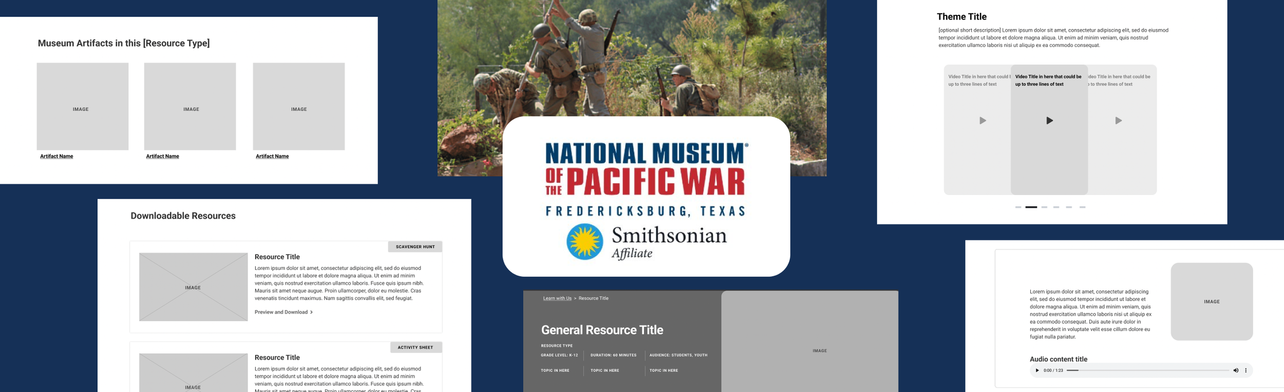
Novel or adapted methods: Applied a modular "Layout System" approach to the sitemap phase, forcing stakeholders to categorize unstructured historical data into specific containers: Resource Listings, Landing Pages, General Resources, or Video Layouts.
Findings that surprised stakeholders: Revealed how intermixing primary sources, teacher lesson plans, and general historical videos within the same UI components confused users and diminished educational impact.
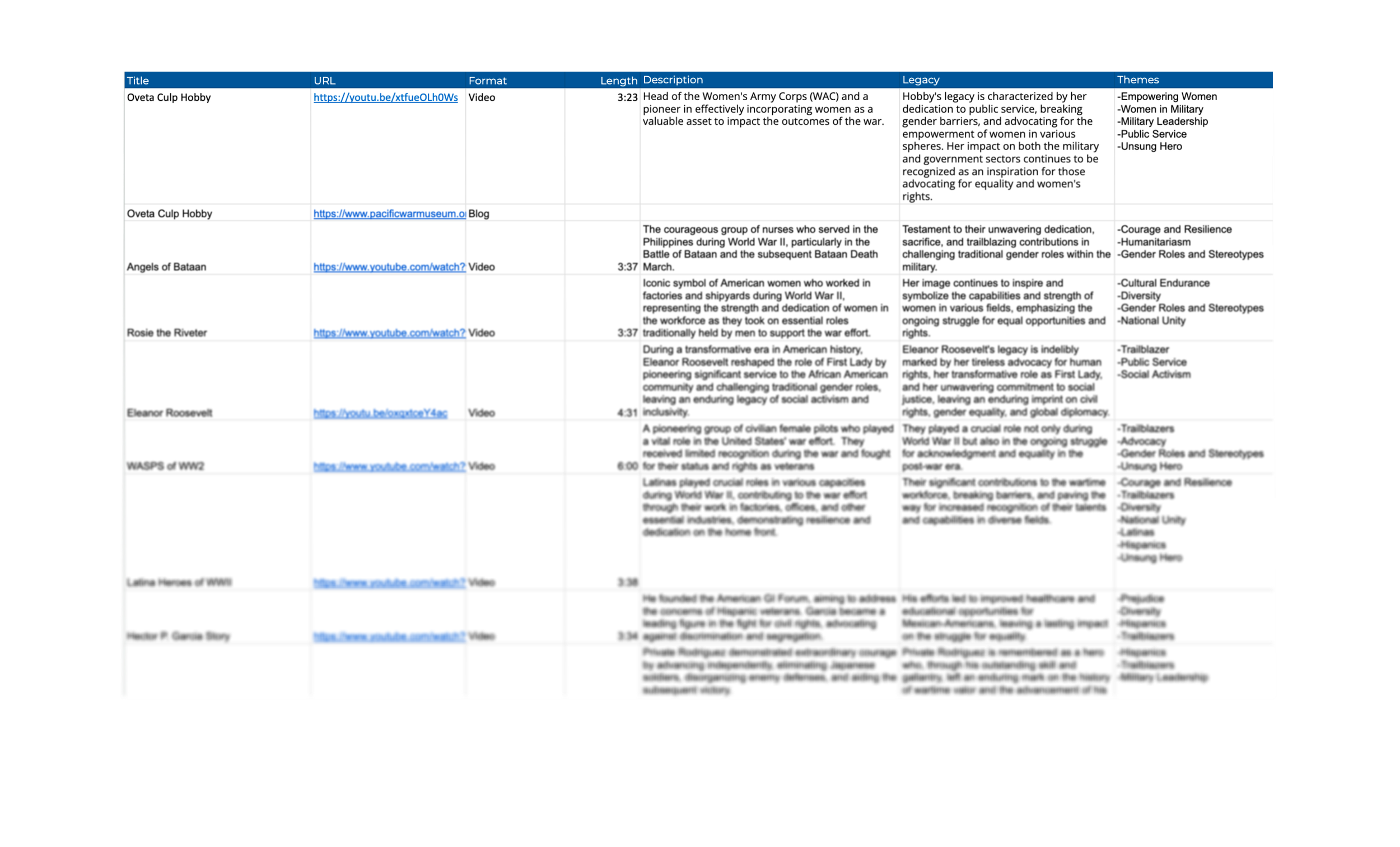
Content Audit
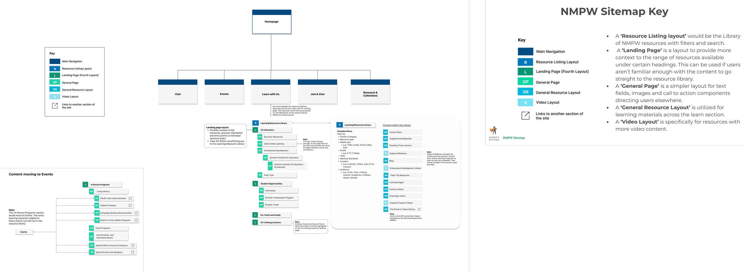
New Sitemap
Redesigned the "Learn" section into a structured educational portal and resource library for teachers, students, and historians.
Information architecture choices: I implemented a strict modular logic to tame a sprawling, disorganized historical archive. I categorized all content into four distinct layout archetypes: Resource Listing, Landing Page, General Page, and Video Layout.
Cross-department collaboration: Worked with client marketing, visual design, and development to migrate the site to a third-party hosting environment while simultaneously executing the UX redesign.

Wireframing the layouts
Key design decisions: I pushed back on mixing general historical content with specific teacher lesson plans. I designed distinct user pathways so that educators could instantly locate pedagogical tools without sifting through general consumer content.
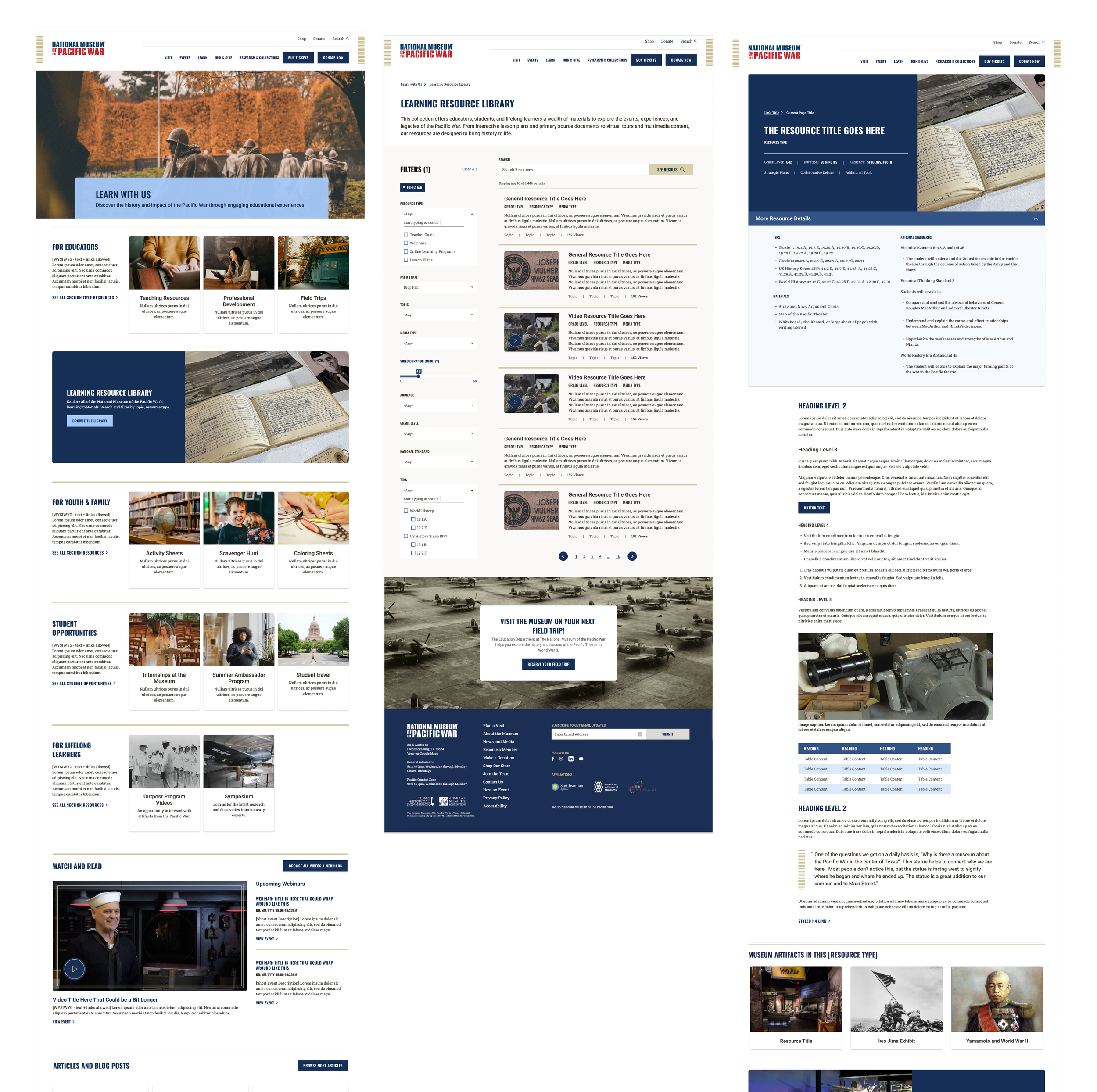
Landing Page, Resource Library and Resource Detail for the new learn section
- What would not have happened without me — The transformation of a sprawling, disorganized historical archive into a structured, digital-first educational portal tailored for specific audience pathways (students vs. teachers).
- Original frameworks or models you created: I designed the 4-Archetype Modular Layout System (Resource Listing, Landing Page, General Page, Video Layout) to force strict organizational logic onto unstructured museum content.
- Domain expertise applied — Educational resource portal architecture, museum digital archives, and distinct audience (educator/student) journey mapping.
- Judgment calls under uncertainty: I had to unilaterally translate raw content audit data into a cohesive sitemap and functional specification document without being present for the initial client ideation.
- Mentoring/Team Direction: I provided structural and functional blueprints that explicitly directed the work of the Visual Designers and Development Lead, ensuring the UX vision was maintained through the 740+ hour implementation.
The Admiral Nimitz Foundation explicitly chose to migrate their main website to the agency for hosting and support first, demonstrating deep trust before proceeding into the complex redesign of the digital "Learn" experience.
Presented the rigorous, modular "Learn Section Sitemap" and corresponding wireframes directly to the museum's educational and marketing stakeholders.
I would have intercepted the "What you're asking for vs. what you need" conversation much earlier. The client initially requested a highly ambitious, gamified interface (referencing Duolingo) that would not have served their core audience of history teachers. I learned I must forcefully realign client expectations with user realities during the first kickoff.
What this changed in my practice
This project reinforced that understanding legacy code is a UX requirement. By taking over the support and hosting of the client's old site before executing the redesign, we gained a crucial "gut check" on the technical infrastructure. This changed my practice to mandate technical infrastructure audits before touching a sitemap. Dealing with complex "TEKS" educational requirements taught me that taxonomy, content types, and fields must be rigidly mapped before wireframing begins.
Thank you for looking through my work!
More projects are right here >>